Window Shopping
By The Warden
 All creatures find themselves lured towards another based on physical attraction. A long tail, colourful feathers, or a shiny coat are exaggerated and flaunted by birds, beasts, and bipeds the world over. Some of these features may stand out among some creatures than others and everyone has their own personal tastes defined by cultural and genetic needs. Myself, I’m a victim for any woman with a brilliant plume of red and gold feathers at the end of her tail (or nice legs, since finding the former hasn’t worked out too well in the past). What I’m trying to say is that despite our desire to overcome base physical attraction, we’re all suckers for a pretty face. Products are no different.
In the roleplaying world, art is the blush that highlights a game’s best features and makes us stop to check it out. While most other forms of print publishing (online or traditional) need only concern themselves with a cover piece to grab our eyeballs and lock us into taking it home, RPGs take it a step further and load up as much original artwork as they can to demonstrate how the game looks when it’s in motion. If a game has an assortment of races, the base stats are listed next to a group shot of every race standing in a pose for size comparisons, the equipment chapter includes a selection of standardized weapons arranged in some form of artistic garage sale, and the front door of the wizard’s keep is not complete without a picture of the magical ruins lining the frame.
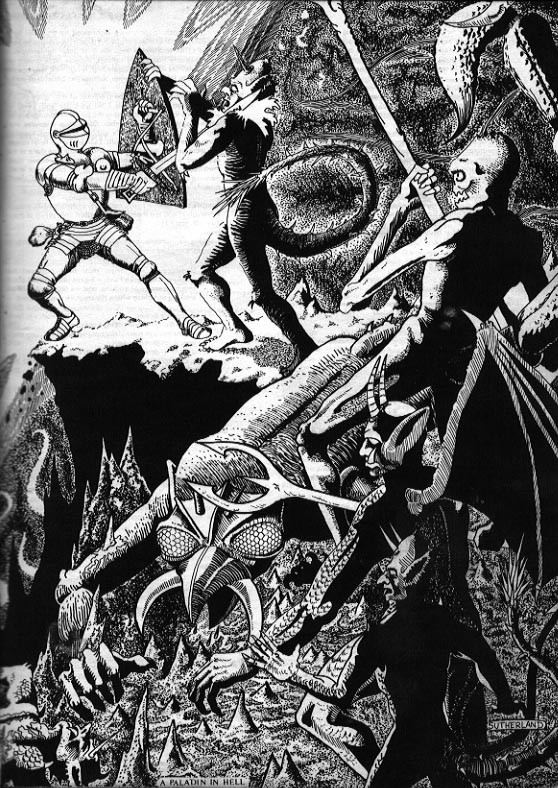
It’s a funny thing, art. At least when it comes to our games. For a game of intense imagination and creativity, many of us cling to a product’s artwork as a shortcut for describing the vicious monstrosity standing before us or laying out a crime scene as our detectives enter the room. Some of them are iconic, such as the infamous Paladin in Hell piece provided in numerous editions of D&D (and even became the basis for its own adventure of the same name) and others set the tone and style merely by brush strokes, colour, and action to become a symbol standing toe-to-toe with the mechanics. What would our opinion be of Pathfinder without Wayne Reynolds’ dynamic work or Larry Elmore’s depiction of Dragonlance‘s characters? A game’s art has become such a fundamental expectation of the genre that it’s next to impossible for a publisher to have their product taken seriously without it, including during a Kickstarter campaign where the goal may be to raise money to pay for artwork and other services.
Personally, I have mixed feelings about the use of artwork in RPGs. As much as I love them and find them a cool device of presentation and professionalism, they do seem to be a crutch for most players, maybe on the same line as battlemaps and props with many modern day games. For example, the D&D Next playtest’s original documents provided possibilities for players to use or forgo maps and minis during play, but my local group prefers to use them because it’s “easier.” Have you ever played in a game or campaign where, after describing the arrival of a wicked dragon or the oncoming army of undead Nazis, players call out for a picture of what you just told them?
The door swings both ways as bad artwork can damage an excellent game’s perception to potential players. For example, there are a few pieces in the original Earthdawn RPG that looked like every hero had their arm broken in three places and I’m not too keen on some of the work done in ICONS to the point that I was loathe to try either one until personal recommendations changed my mind. Now I’m beyond satisfied with my old Earthdawn book, even though I still cringe looking at that thrice-busted arm (a side effect of having broken bones myself). Without that personal voucher, there’d be a four-inch gap on my bookshelf right now.
From a publisher’s standpoint, artwork is very expensive. From an indie publisher’s standpoint, it can be the difference between making back your investment and staying in the red, giving rise to RPG-inspired clip art selections offering small publishers a break on production costs. It’s a common tactic used for free publications and while they are initially helpful to getting people to check out your work, it can be a bit embarrassing to find the piece pasted on your cover gracing two or three other products within a few weeks of its release. The matter became even more complicated in 2000 when Wizards of the Coast released a certain new edition (I’ve already mentioned it a couple of time in this post, so it can take a hit this time) packed with full colour pages in a layout designed to look almost like a spellbook or mystical tome found within the game’s world. As soon as that hit the shelves, everyone started to make their books look like full-colour tomes written on parchment and this has lead to a necessary (and unfortunate) increase in production costs and price tags for RPGs. It’s not enough any more to have a game with some artwork every six or seven pages, now you have to make every page look as if it’s been drawn. (This is complicated by limited editions bound in leather with embossed pages and so forth, but that’s another discussion altogether).
So if a game’s artwork sets the bar for a buyer’s expectations of the entire product, is that a fair assessment of the game itself? Are we as consumers placing too much emphasis on the game’s artwork as an expression of a game or are publishers expecting too much from its artwork to remain competitive in an already crowded market? Is it possible to step back and tone down the artwork for the sake of profitability and sustainability in a product line while maintaining its attraction to the average roleplayer?
Those are tricky questions to ask because there’s a huge risk in trying. It’s the equivalent to asking if it’s possible for a movie to bring in $1 billion at the box office without needing a special effects budget – there’s only one way to know for sure, but no one wants to actively experiment with it. Then again, that may be an inappropriate analogy. Perhaps it’s a bit more akin to releasing a big budget movie without a trailer. Just as a movie trailer introduces us to an upcoming film’s premise, so too does a game’s art tease us with its potential. Unfortunately, there are some trailers that exceed the actual film (the trailer for the Hitman movie is far better than the actual movie). When we flip through the pages of a roleplaying game judging whether or not we want to buy it, depictions of characters scaling the side of a steep cliff while shooting at vile monsters provides an instant glimpse of what to expect. “Cool! There are rules for that kind of a fight. I’ll buy it!” Truth be told, a decent game should always allow the main character an opportunity to fight in unusual and difficult circumstances. They’re not novels with fixed situations and locked characters, they’re roleplaying games released to set a baseline of expectations and mechanics to pull them off.
Let’s take a moment and consider how else a game could present itself without artwork. If you’re standing in your FLGS hunting for the next core rulebook to fill your gaming nights, what else would draw you towards one game in particular? Without artwork, there’s very little publishers and designers can offer as distinguishing features other than previews, word of mouth, and other text-based tactics. For consumers, they’d be staring at a sea of white pages and black type from one wall to the other, forcing them to read everything waved in front of their face while blocking out the cacophony of alternative options desperately trying to get their attention. So yeah, we need artwork to make that initial impression and as our world becomes more and more visual (even the “buttons” you press on your phone can’t just look like a box with words in them, they have to look 3D with a fake reflective surface painted over them), the need for a game’s artwork to push said game deeper into the market will increase.
As a game designer, my opinion on artwork is incredibly biased. As much as I’d love it if everyone involved in this wonderful community were mechanics junkies like myself, that’s not the case. A game’s visual presentation – artwork especially – will continue to be a fundamental part of the promotion and enjoyment process of a game and will remain a massive draw for new and old players alike. The trick will be discovering unique ways to blend the two together so that the art compliments the mechanics and aids the learning and appreciation process of the mechanics so that it’s hand-in-hand and players cannot think about one without the other. To demonstrate that possibility, I’d like to leave you with this comic book-style presentation of the Awesome System‘s rules as found on the Sharkpunch Studios website.


As a blind person, I can tell you that artowrk is most certainly not what sells a game to me. A solid theme and perhaps a rules preview are far more important.
That being said, as a blind *game designer* I still find myself having to spend the majority of my budget to commission artwork, since even I know you can’t sell a game without art. It’s sad, but for the time being at least it’s true.
I did buy a few small Pathfinder supplements recently that were basically artwork free, aside from just a simple (rather ugly) border and a parchment background. Of course, those supplements were about 5 pages long, including the OGL statement, and cost me $2 each.